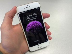
It is nearly impossible to overstate the importance of mobile in the modern business world. In fact, studies indicate that 80% of people will delete an email if it doesn’t look good on their smartphone. Mobile design is important to marketers looking to maximize the effectiveness of their message.

Mobile design is important to marketers looking to maximize the effectiveness | Photo: John Karakatsanis (Flikr)
A key feature when designing your email for mobile is making sure that your email is easy to scan and engage with on a user’s mobile device. The simpler the better as cluttered emails are not easy to scan. Make sure you content is easy to read and simple to consume with eye-catching images, large fonts and call-to-action buttons that stand out. Don’t forget to use white space and make sure you organize your content into sections with headings to make skimming easy for your readers. Many mobile email designers find a single column layout to be the easiest and most effective to work with.
One great feature of mobile design is that your emails will still look good on a user’s desktop device. In fact, most users will be used to seeing mobile design when it comes to their in-box. That is why it is a good idea is to design for the small screen first. If your email looks good on a smartphone, it will also look good on a desktop.
Many businesses will set up an email template that is responsive. Here your email will adapt to the device your reader is using to view the email.
Don’t forget that any links you include are to pages that are optimized for mobile. You don’t want your customer to bail at the last moment because your web link was to a page that was hard to navigate on their mobile device.
Follow these tips and you will see your email marketing have better results.
Photo: http://bit.ly/1LLAB7S
Kimber Johnson
Latest posts by Kimber Johnson (see all)
- How Your Business Can Create Great Customer Experiences - February 5, 2017
- How to Capitalize on Opportunities Created by Mobile Commerce - January 4, 2017
- Mobile App Monetization Trends for 2017 - December 4, 2016
